
- Community Home
- >
- Storage
- >
- Around the Storage Block
- >
- NimbleOS 4 - Next Generation HTML 5 GUI
Categories
Company
Local Language
Forums
Discussions
Forums
- Data Protection and Retention
- Entry Storage Systems
- Legacy
- Midrange and Enterprise Storage
- Storage Networking
- HPE Nimble Storage
Discussions
Discussions
Discussions
Forums
Discussions
Discussion Boards
Discussion Boards
Discussion Boards
Discussion Boards
- BladeSystem Infrastructure and Application Solutions
- Appliance Servers
- Alpha Servers
- BackOffice Products
- Internet Products
- HPE 9000 and HPE e3000 Servers
- Networking
- Netservers
- Secure OS Software for Linux
- Server Management (Insight Manager 7)
- Windows Server 2003
- Operating System - Tru64 Unix
- ProLiant Deployment and Provisioning
- Linux-Based Community / Regional
- Microsoft System Center Integration
Discussion Boards
Discussion Boards
Discussion Boards
Discussion Boards
Discussion Boards
Discussion Boards
Discussion Boards
Discussion Boards
Discussion Boards
Discussion Boards
Discussion Boards
Discussion Boards
Discussion Boards
Discussion Boards
Discussion Boards
Discussion Boards
Discussion Boards
Discussion Boards
Discussion Boards
Community
Resources
Forums
Blogs
- Subscribe to RSS Feed
- Mark as New
- Mark as Read
- Bookmark
- Receive email notifications
- Printer Friendly Page
- Report Inappropriate Content
NimbleOS 4 - Next Generation HTML 5 GUI
I’m pleased to kickoff the first blog in the series NimbleOS4: A Detailed exploration.
With the release of Nimble OS version 4, customers will notice a significant change to the look and feel
when they first login to their arrays after upgrading to NimbleOS4.
The Next Generation User Interface (NextGen UI) for Nimble Storage represents a big milestone. Having used
it quite a lot myself over the last few months, I’ve come to really appreciate the work that went into it.

When developing the NextGen UI, Nimble had three primary goals: first, migration to a modern UI framework,
second, create a system to facilitate efficient design, implementation, and multi-platform support, and finally,
remove the dependency on Adobe Flash. These changes will allow us to continue to develop and enhance the
functionality moving forward and extend the interface to devices that previously weren’t possible.
When users login, the first thing they will notice is the new login banner with a usage warning. This can be
customized to meet each customer’s needs or disabled. It can also be configured to require a user agreement
before connecting.

Once connected, users will be presented with a more compact and intuitive dashboard view. We have changed the
main workspaces to better reflect how users interact with our arrays. This main view gives users a more complete
picture of the health of their array in a single pane.

Under the manage workspace, users can navigate and make changes to storage, protection, access, and performance configuration.

One significant change is the summary view which shows more information about each volume on the main screen.
Users can move between tabs for space, performance, and protection to get more detailed information.

Accessing the other management functions no longer requires a drop down menu selection, but are easily accessed
by selecting the focus area on the main manage screen. This makes it much easier to navigate to different
workflows and tasks compared to the previous GUI.
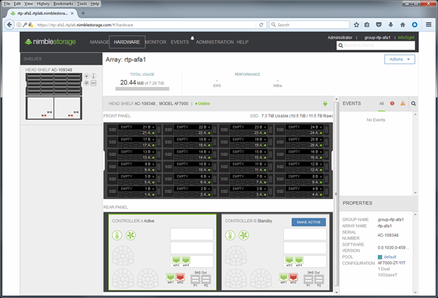
The hardware workspace is also much easier to access. By clicking on hardware on the top menu bar, users are
immediately presented with a complete overview of their arrays. We find this much quicker than the previous
view of having to navigate to the Group (wait for the graphs to load) and then to drill down to each specific array.
The visual representation is much more aligned to the physical array making it easier to correlate event activity
with the physical hardware platform. Events are easily accessed on the right hand side of the screen and can be
filtered based on severity. A convenient properties section gives complete information about the array.
The monitor workspace gives easy one-click access to each area without the need to go through the dropdown list.
Users can quickly and easily navigate through capacity, performance, interfaces, replication, connections, and the
audit log. Links to Infosight are provided where applicable and further detail based on application type and volume
collection are also presented on the main screen.

The interaction of the workflows and the improved performance of the GUI is hard to articulate in a blog with pictures,
we have therefore created some common workflow videos to demonstrate the changes to the Nimble OS user interface
and help customers become familiar with the new framework.

csullivan43
Craig has over 25 years of experience managing and architecting solutions for SAP and SAP HANA. He is responsible for the storage certifications of HPE Nimble Storage products.
- Back to Blog
- Newer Article
- Older Article
- haniff on: High-performance, low-latency networks for edge an...
- StorageExperts on: Configure vSphere Metro Storage Cluster with HPE N...
- haniff on: Need for speed and efficiency from high performanc...
- haniff on: Efficient networking for HPE’s Alletra cloud-nativ...
- CalvinZito on: What’s new in HPE SimpliVity 4.1.0
- MichaelMattsson on: HPE CSI Driver for Kubernetes v1.4.0 with expanded...
- StorageExperts on: HPE Nimble Storage dHCI Intelligent 1-Click Update...
- ORielly on: Power Loss at the Edge? Protect Your Data with New...
- viraj h on: HPE Primera Storage celebrates one year!
- Ron Dharma on: Introducing Language Bindings for HPE SimpliVity R...
